Publication Design
CASE STUDY
- Product: Print & Web Bulletin Series
- Industry: Education
- Audience: Texas high school students
- Timeline: 6 months
BRIEF
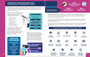
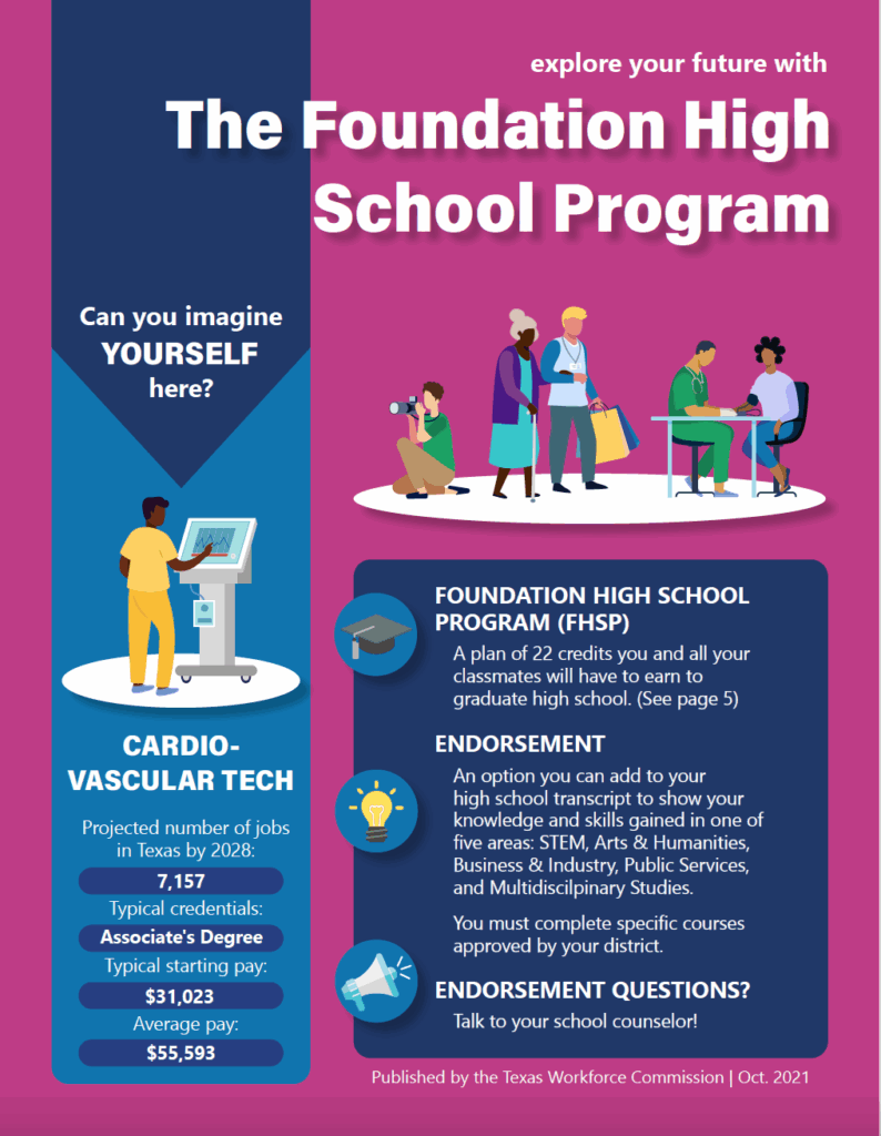
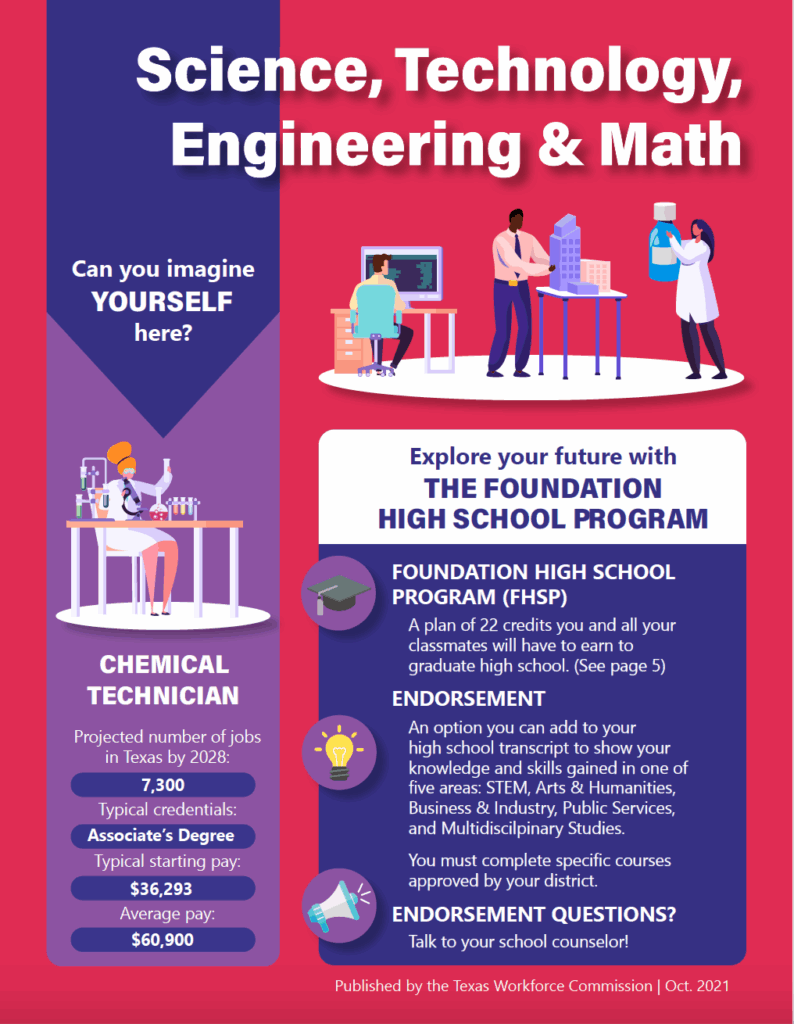
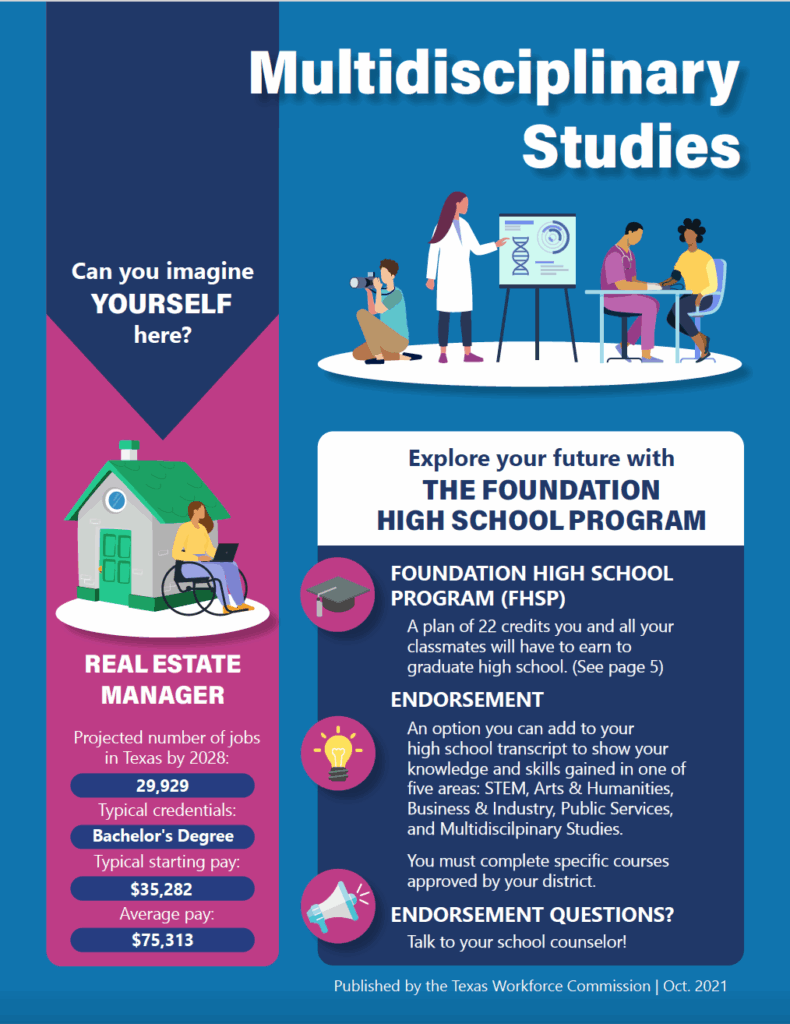
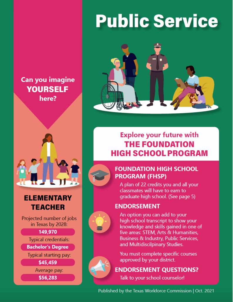
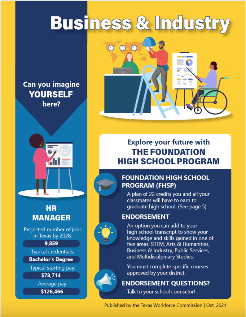
Produce 6 cohesive bulletins to help inform teens about the FHS program. Key words: eye catching, diverse, educational. The color schemes for each document should be related, but distinct.
SUMMARY
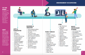
I started by creating an InDesign template for laying out all 6 documents, so they would look like cohesive pieces of a larger series. The client expressed interest in an “elevated rainbow” as the overall color palette, so I chose a bold color for each bulletin, but stuck to varying monochromatic shades as accents. The Sampler bulletin (shown here in purple) was an overview of the program, while the remaining five bulletins explored separate endorsements. All 6 bulletins are available in print and online.

Logo Design
CASE STUDY
- Product: Logo & Branding
- Industry: Faith-based organization
- Audience: Christian women of all ages
- Timeline: 1 month
BRIEF
Design a logo and social media branding for a women’s church group. Key words: simple, elegant, love, faith, and femininity. Incorporate a cross, a heart, and a symbol representing women (silhouette, floral element, etc.). Preferred colors are soft pastels and a deep gold.
SUMMARY
After speaking with the client, I provided three options as a jumping off point. The one pictured here is the “modern” option, which she ultimately chose. The logo merges the requested heart and cross shapes into a stylized pansy, a flower known for symbolizing introspection, passion, and femininity. Its position within the “O” is meant to evoke images of a stained glass church window. The goal with this design was to balance tradition with approachability, furthered by pairing the logo with a modern serif for the tagline.
Illustration
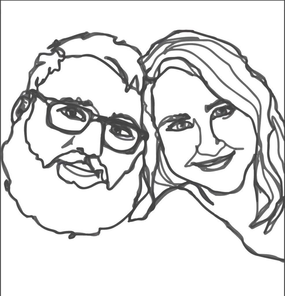
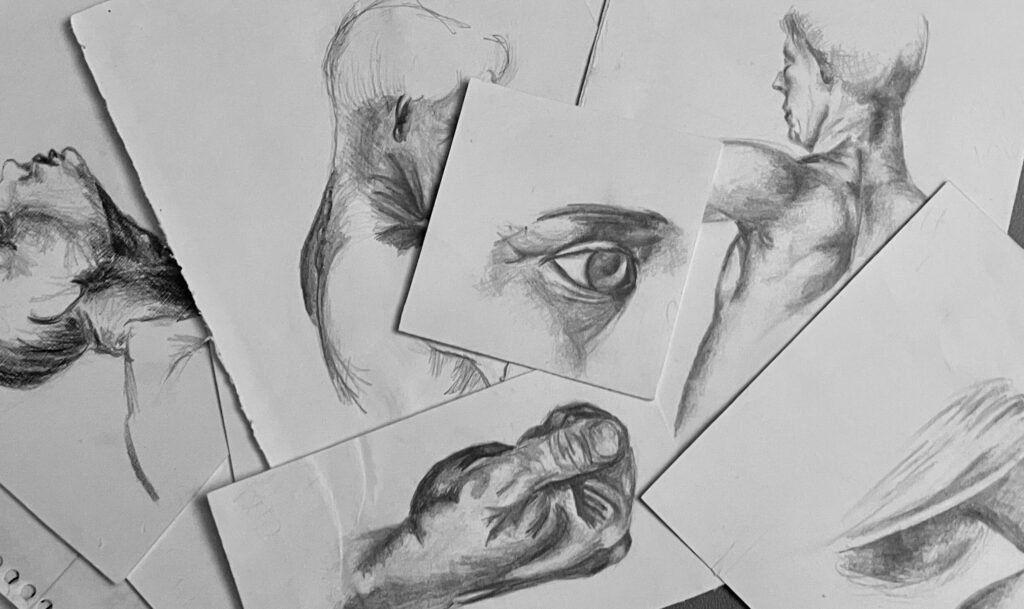
Although my art is mostly digital these days, I started out with cheap pencils and acrylic paint. I love portraiture and illustration work of all kinds, and I’m always up for a job that requires some doodling.
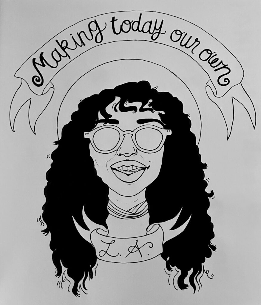
I’m familiar with a variety of digital art software, including Procreate, Photoshop, Illustrator, Fresco and Canva. I’ve included samples here of my pencil sketches, a couples’ portrait drawn in Illustrator, and a before-and-after shot of a portrait drawn with ink and paper, scanned, and digitally colorized in Photoshop.
Social Media
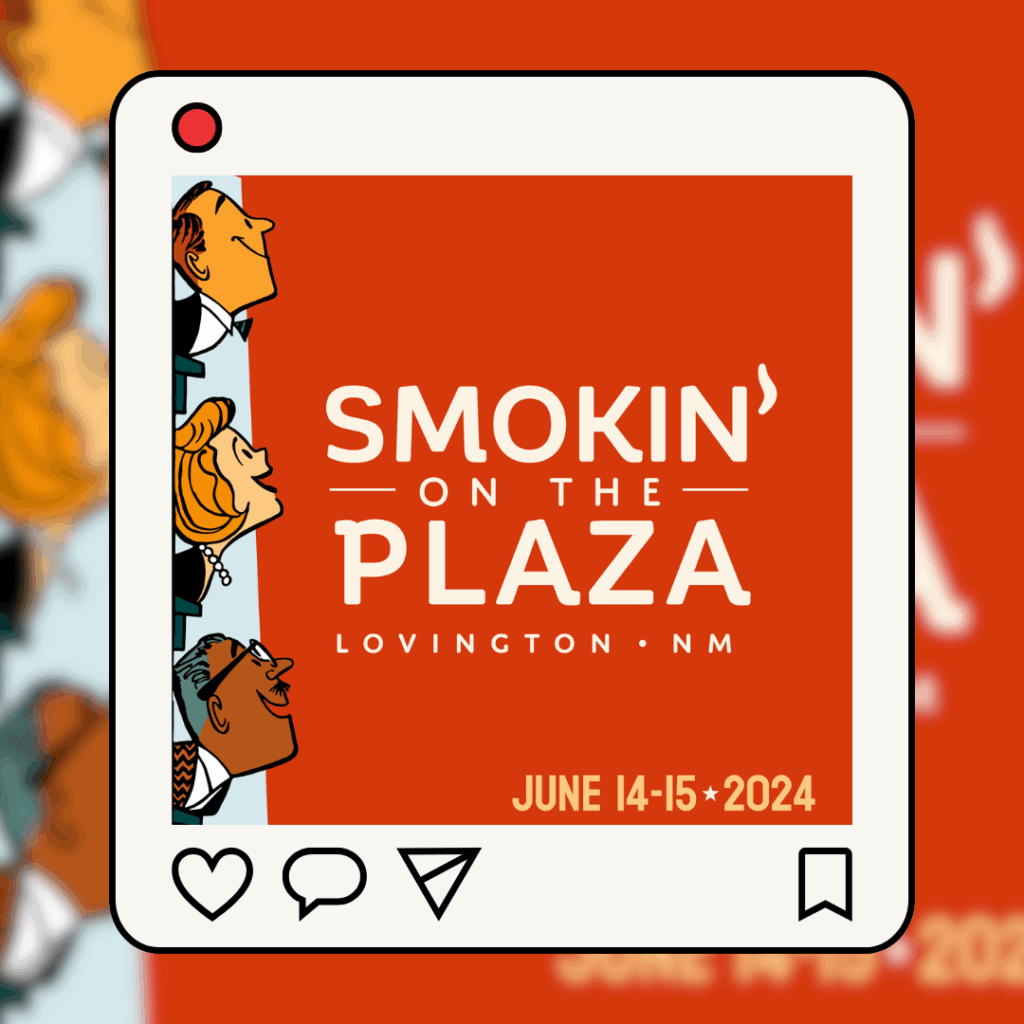
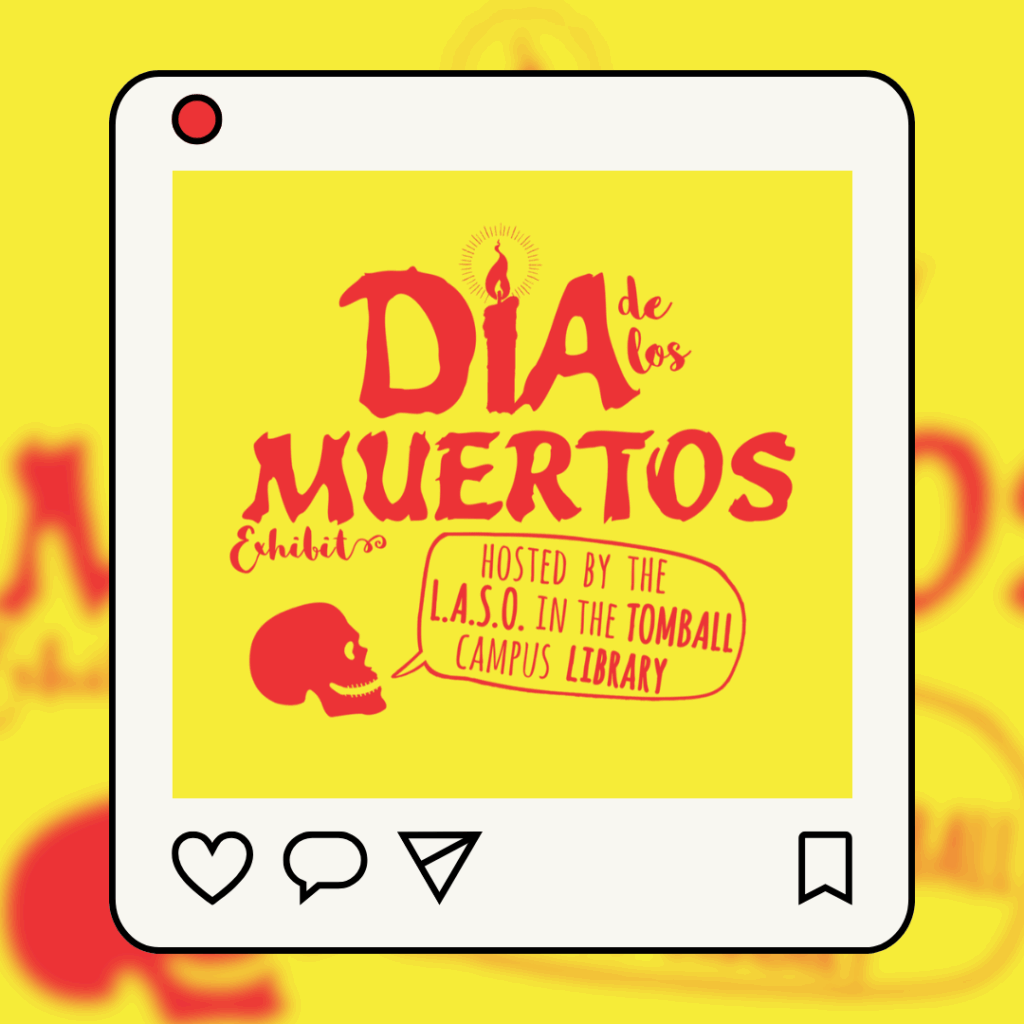
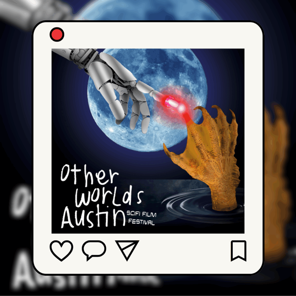
Brand design often comes hand-in-hand with social media marketing on platforms like TikTok, Instagram, and Facebook. These are a few samples of projects I’ve assisted with visuals for their networking sites.
Web Design
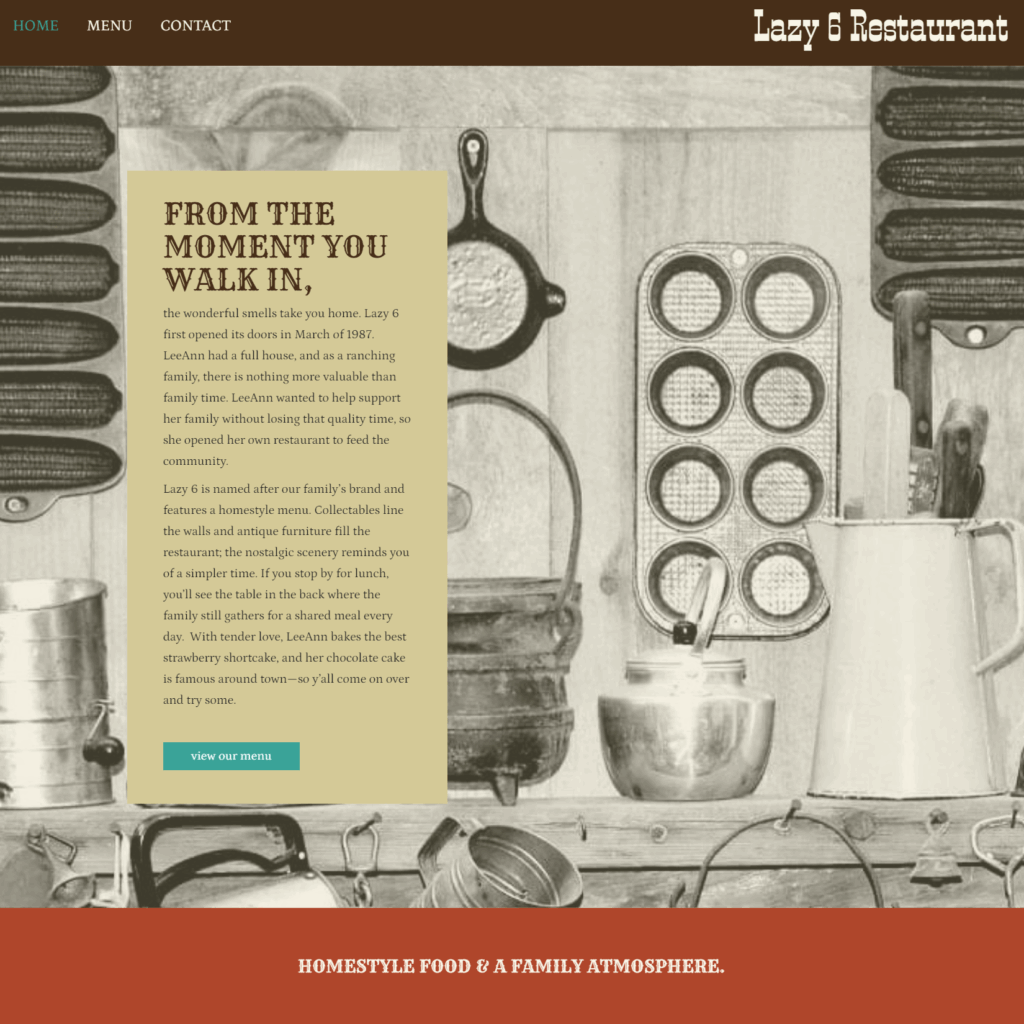
I’ve helped over a dozen small businesses and nonprofits develop their online presence by creating websites using CMS systems, including WordPress, Wix, Squarespace, and Shopify. These platforms allow my clients to update and maintain content within a framework we’ve established through a collaborative design process. In some cases, clients were heavily involved, while others relied on my direction to inform the branding of the project.
RESPONSIVE | ACCESSIBLE | ENGAGING
When I work with my clients, I want the final product to do more than just draw people in; I also want the design to be as accessible as possible to ensure it’s able to reach all audiences. Accessibility-centric design influences my entire process, from wireframing and layout to color and typography.
Some Other Samples
TEXAS LABOR MARKET REVIEW
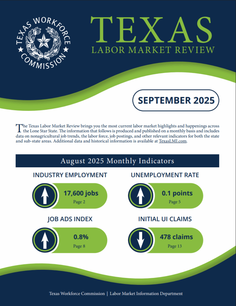
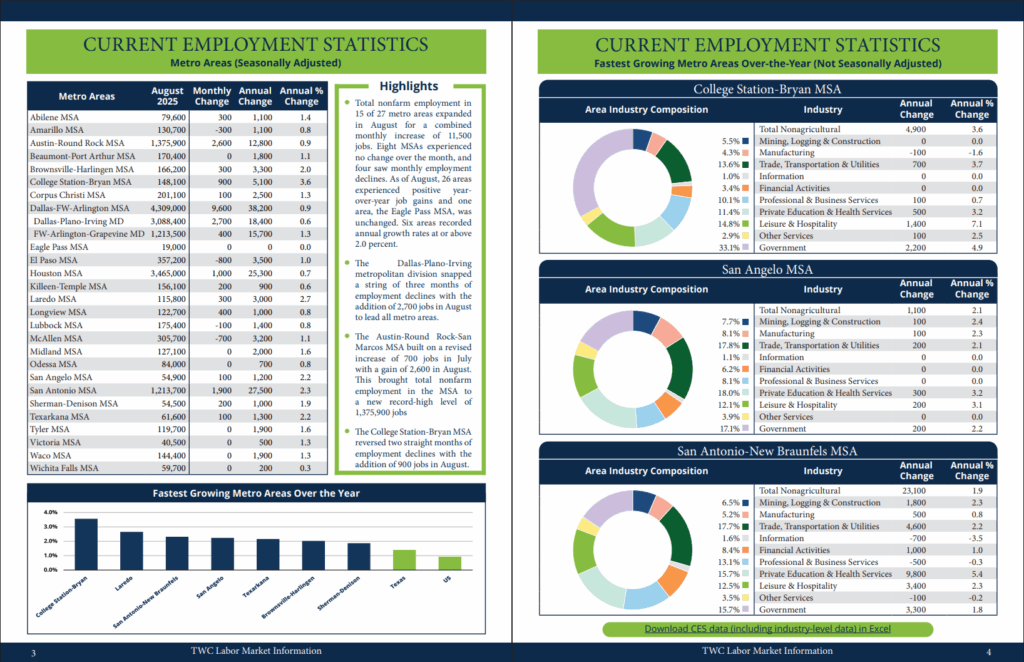
In 2021, I redesigned the Texas Labor Market Review, a monthly publication released by Texas’ Labor Market Information department. For the next four years, I was responsible for the recurring layout and design work on the review. I published the document online each month at TexasLMI.com, accompanying it with a govDelivery announcement to approximately 30,000 subscribers.
CAREER SUCCESS WORKBOOK SERIES
The Career Success project was my largest undertaking while designing for the Education Outreach team at Texas Workforce Commission. This was a Tri-Agency initiative, with input from three separate state entities: the Texas Workforce Commission (TWC), Texas Educational Agency (TEA), and the Texas Higher Education Coordinating Board (THECB). The collaboration took nearly a full year to complete, culminating in 110 pages of content split between three separate workbooks. There is an optional exercise portfolio in interactive PDF format for those working through the digital version. I also designed a comprehensive “complete workbook,” which is a 3-in-1 product for educators, parents, and students who would rather pick up the entire series in one package. All deliverables were created in both digital and print.
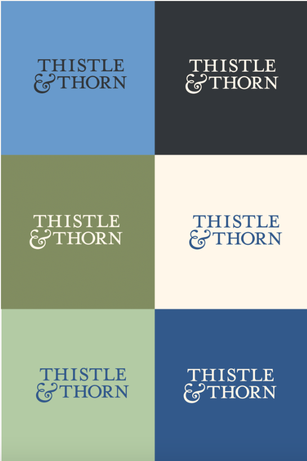
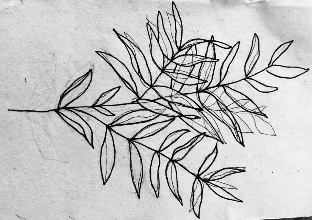
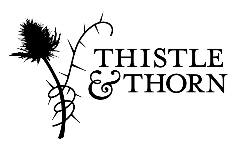
THISTLE & THORN BRANDING
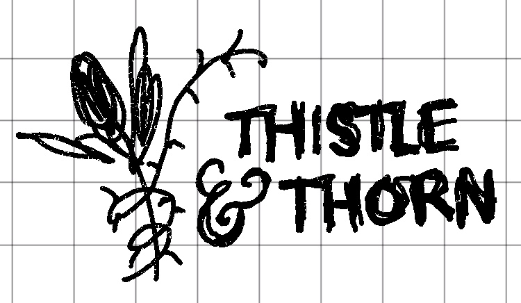
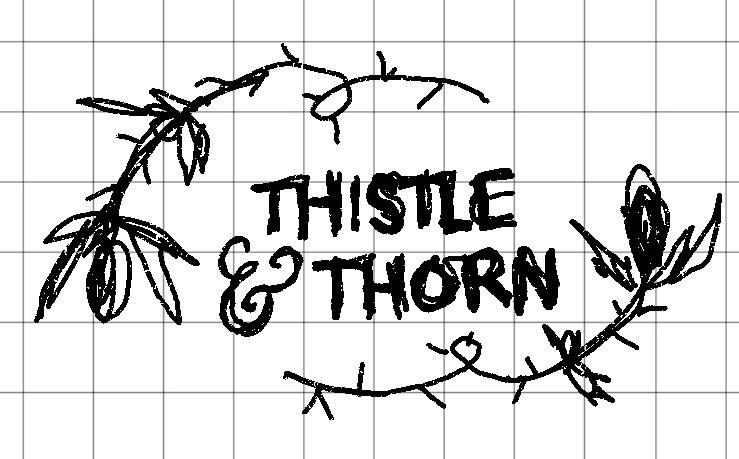
This was a personal project to help solidify my brand while freelancing. Here are a few early-stage draftings of a logo and brand direction, which were later developed into a cohesive color palette and wordmark.


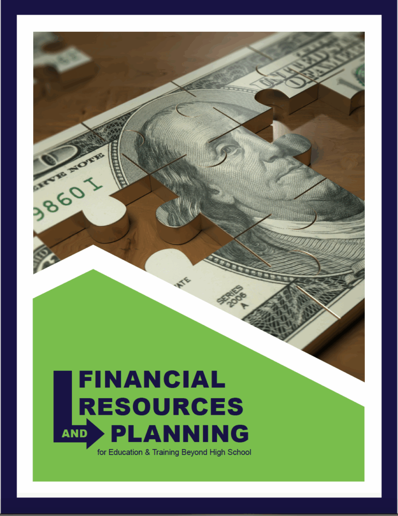
FINANCIAL AID PAMPHLET
Financial Resources & Planning is a project designed for the Education Outreach branch of the Texas Workforce Commission (TWC). The document points to the various avenues of aid available in Texas for anyone seeking continued education or training beyond high school. The pamphlet is intended for both traditional and nontraditional students as a means to help demystify the processes behind aid distribution. As with all TWC designs, this is available in both print and digital versions.
